For Designers
Share Work, Build Presence
Document process, receive feedback, and build an audience without being pushed to optimise for engagement over quality.
A platform for footwear designers that treats craft, community, and commerce as equal parts of the same thing.
Footwear designers don't have a home. They patch together Instagram for visibility, Behance for portfolio, and DMs for commissions. None of those were built for them, and all of them treat the work as secondary to the platform's own logic.
Forge is what I wanted that platform to be. The premise was simple: build something that actually respects what designers do. Not just somewhere they post things.
The balance I kept coming back to: it shouldn't feel like an e-commerce app pretending to be social, or a social app pretending to sell. Either extreme kills what makes it interesting. The whole thing had to hold both without one eating the other.
Document process, receive feedback, and build an audience without being pushed to optimise for engagement over quality.
Find designers by craft and aesthetic rather than follower count. Commission work directly through the platform without external back-and-forth.
I started with flows before I touched anything visual. The questions that mattered early were structural: who is this for, how does the platform know, and how does that change what happens next. Getting those wrong at the start would have broken everything downstream.
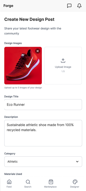
Three flows covered the core: how users enter by role, how a purchase moves from feed to checkout, and how a designer posts and gets back to their work. These wireframes aren't pretty. They were the actual design work.
The logo is modular and intentionally structural, built from parts the way footwear is. I made it in Illustrator from scratch rather than adapting a typeface, because adapted typefaces always carry someone else's logic in them.
The opening animation is quiet on purpose. The first signal to a user should be that this platform is about craft, not noise. A flashy intro would have said exactly the wrong thing.

The platform runs on a structure that doesn't try to do everything at once. Designers share and document work. Makers and brands discover or commission. Social features support visibility. Commerce integrates without dominating.
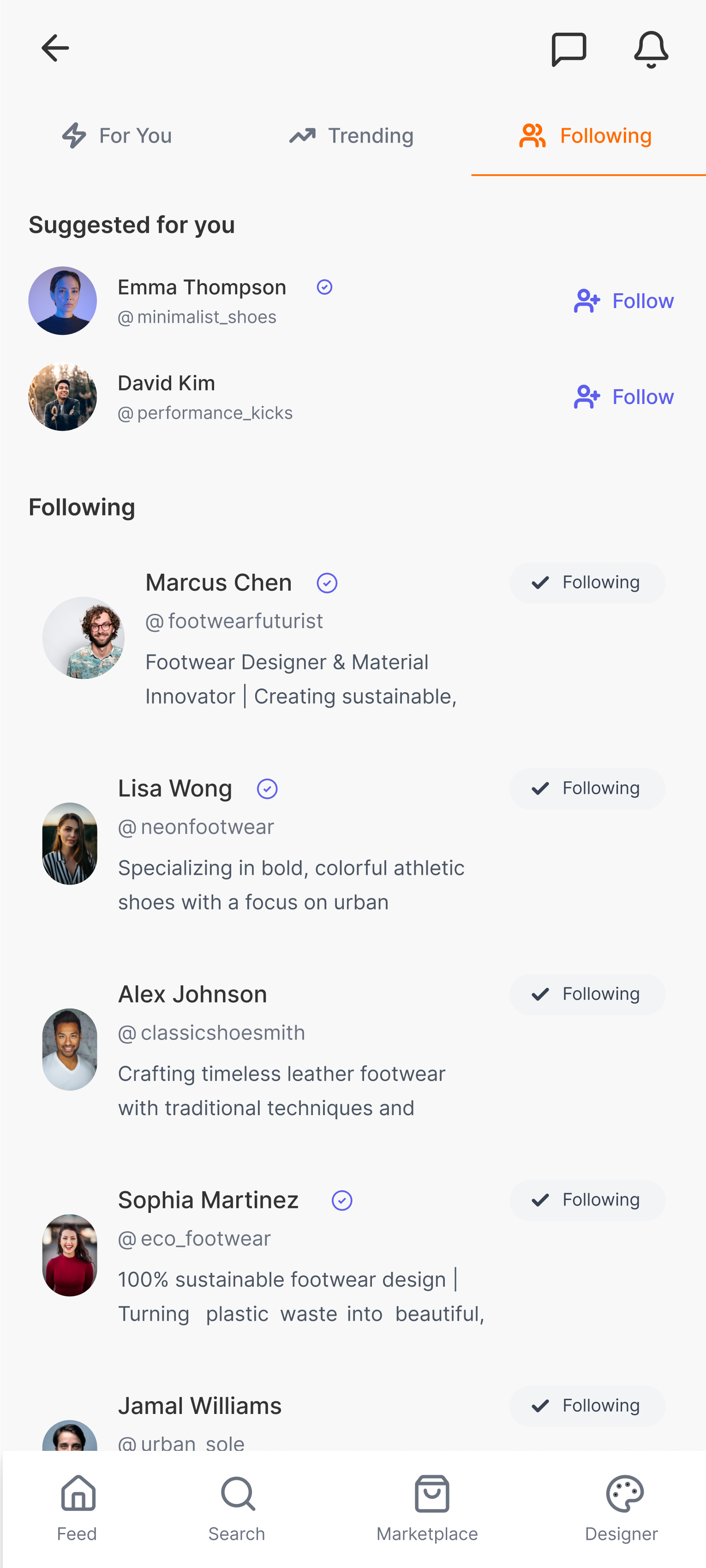
Home, Trending, Following. These three feed views are the daily core. They look similar but they're doing different things. Home surfaces everything. Trending shows what's gaining traction. Following keeps it tight to people you've already decided matter.
The first thing you do when you open Forge is pick a role: Footwear Designer or Shoe Maker. That single choice changes everything that comes after. Content, recommendations, what your profile can do, what actions are available, all of it adapts based on who you said you are.
That's not a personalisation feature. It's how the platform thinks about you. Designing for one generic user type would have made every screen worse for everyone.
After that the setup stays minimal. I only asked for what was actually needed to get someone to the core experience. Every extra field is a reason to close the app.
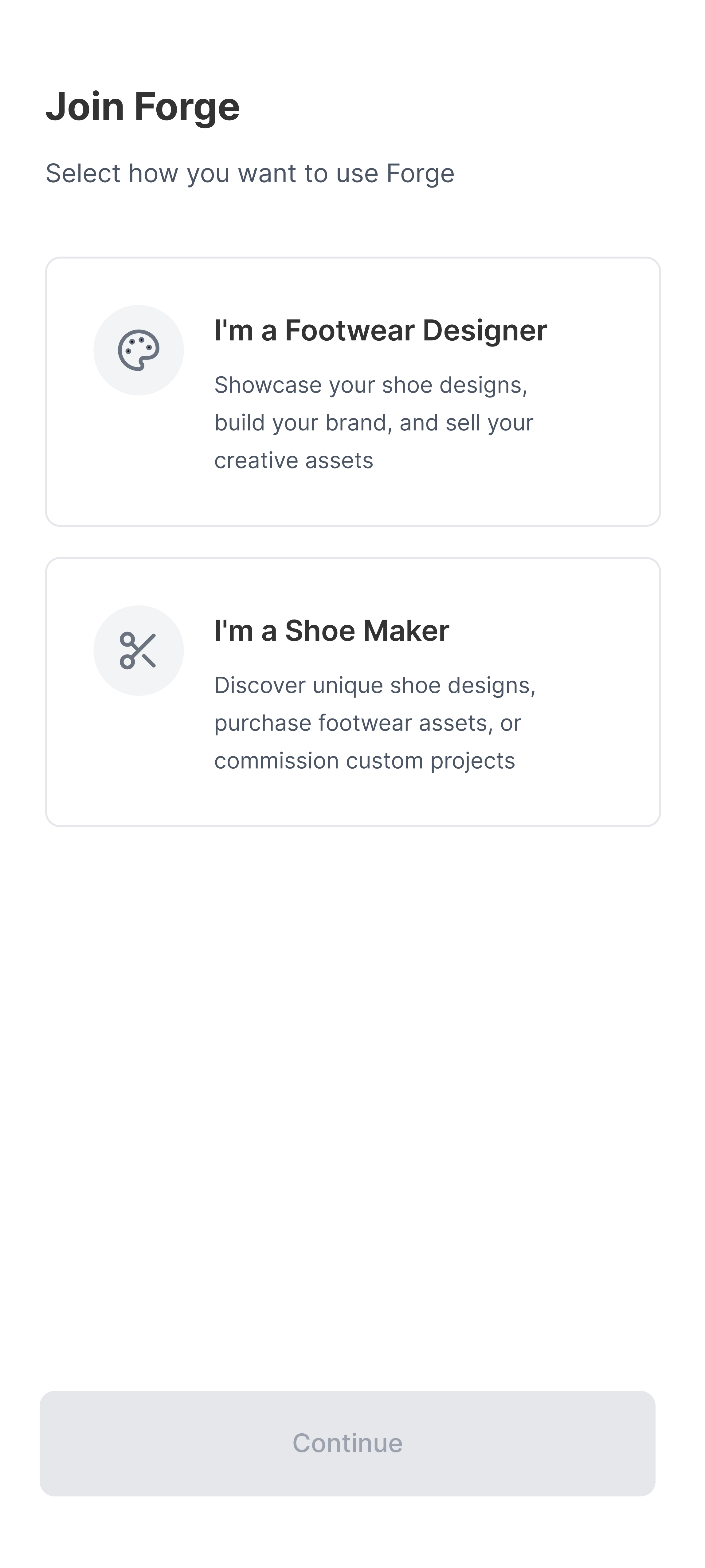
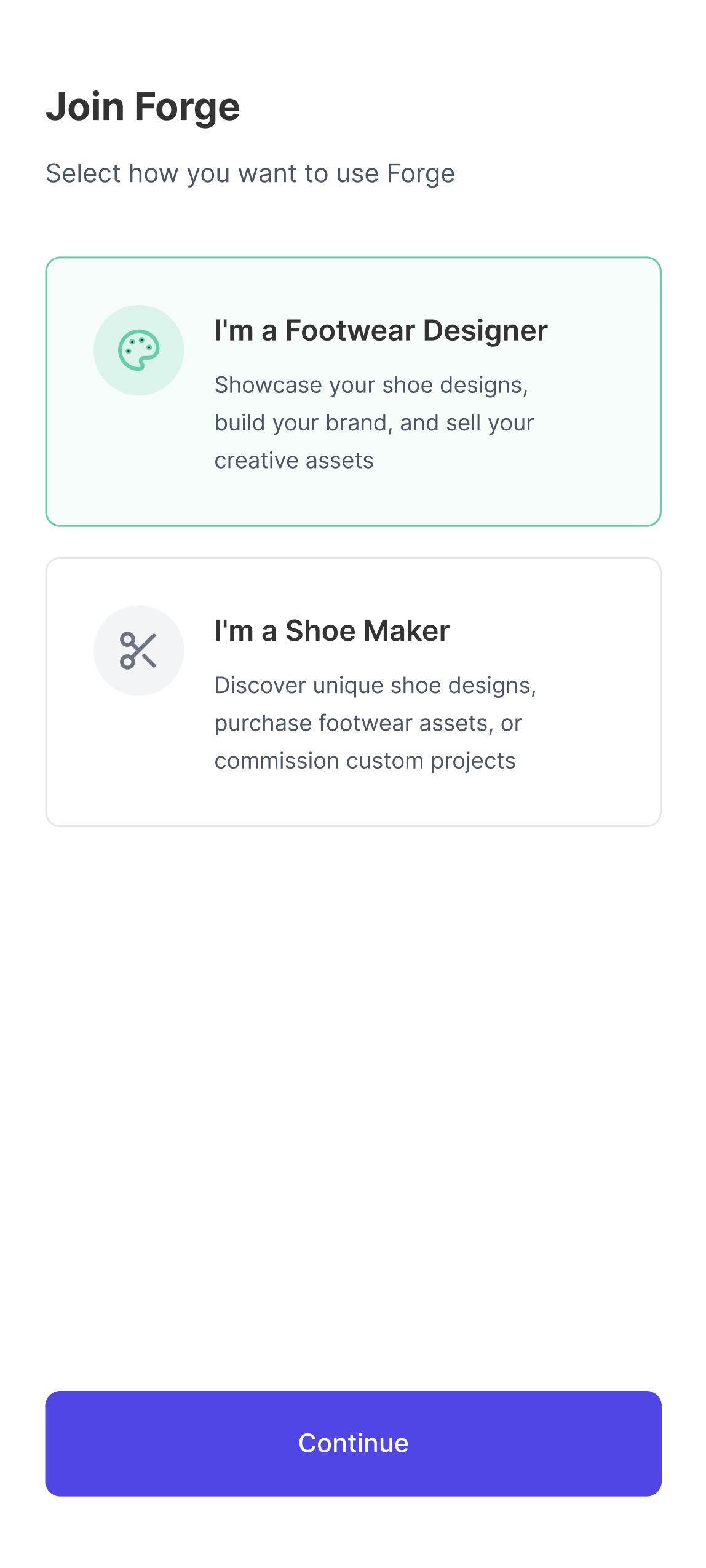
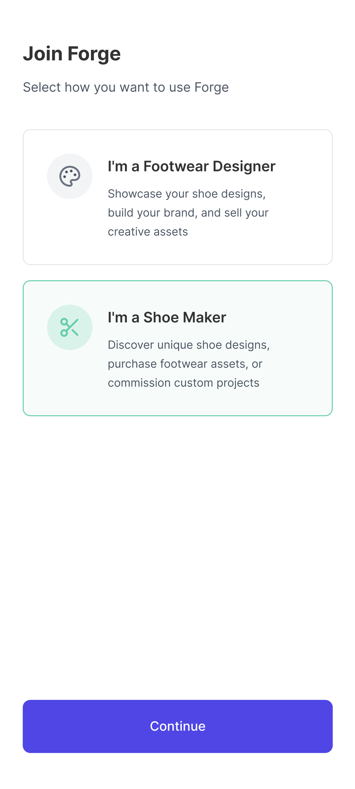
Designing for two user types at once forced every decision to be honest. If a feature only worked for one of them, it probably wasn't the right feature.
On designing role-based systems
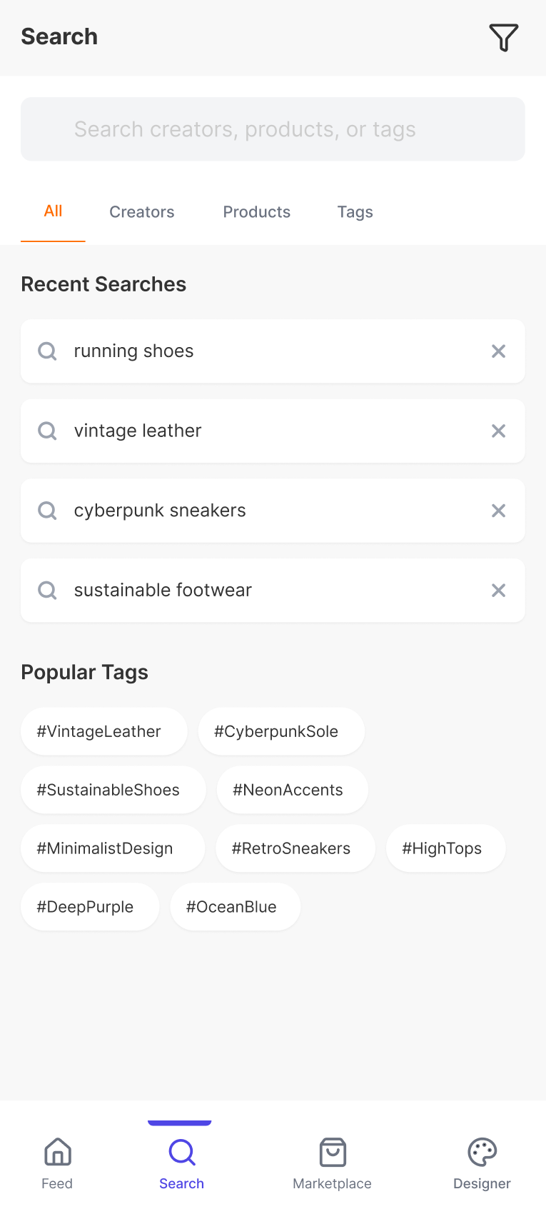
Exploration and searching are different things and they shouldn't share the same space. When you're scrolling for inspiration you don't want filters. When you know what you're looking for you don't want a feed.
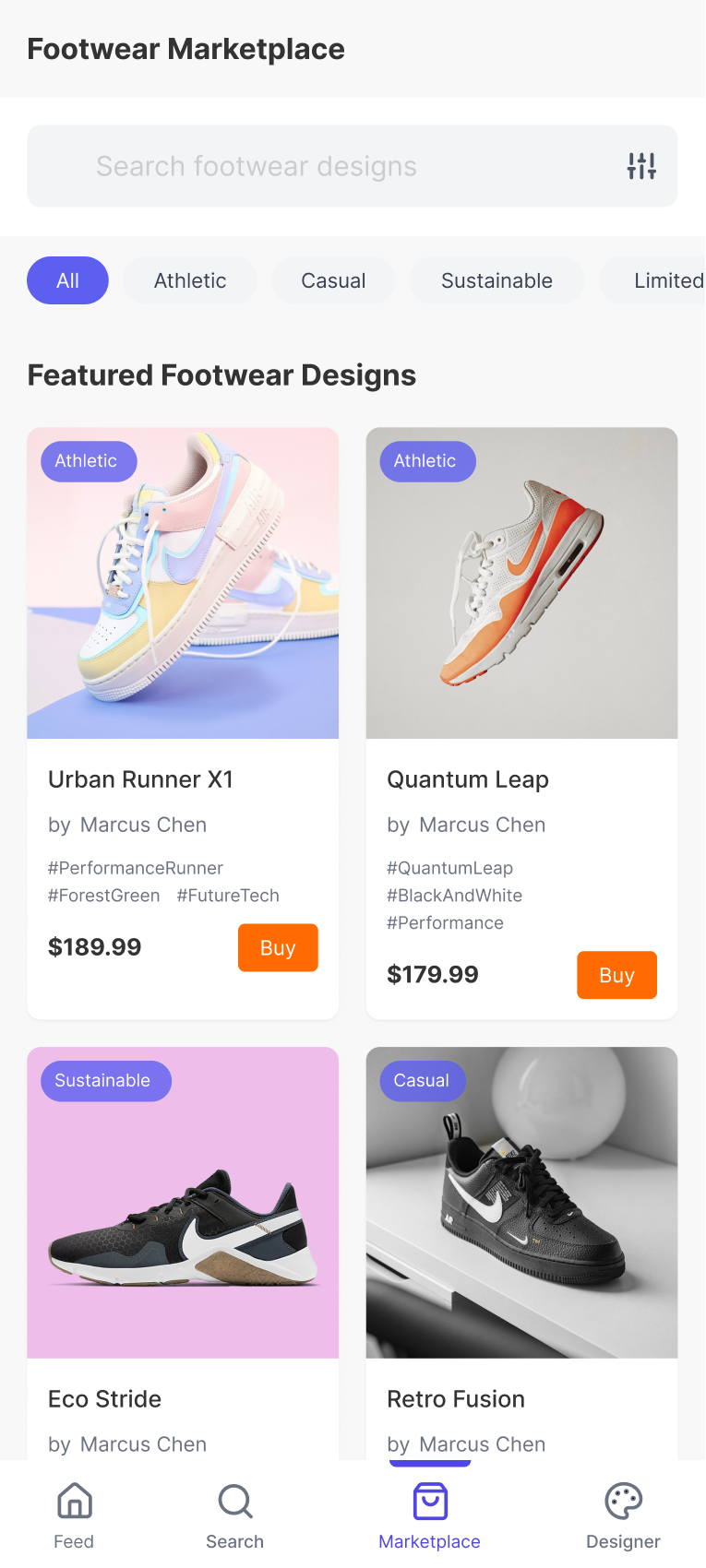
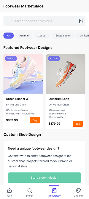
Forge separates these intentionally. The feed is for browsing freely. The marketplace is for browsing with intent. Keeping them distinct means neither one has to compromise to accommodate the other.
Casual browsing, inspiration, unexpected discovery. No pressure to decide. Work surfaces naturally through the feed.
Structured browsing with filters, categories, and clear purchase paths for users who know what they're looking for.
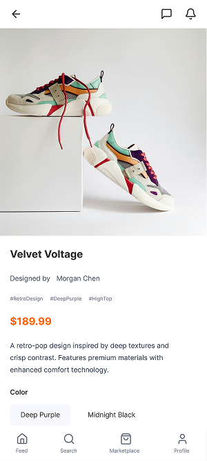
Product pages lead with the design story before the price. That's a deliberate choice. Making buying feel like supporting a designer rather than completing a transaction changes how the whole page reads.
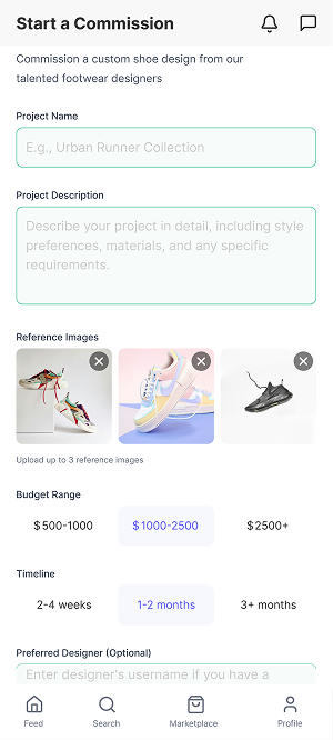
The purchase path stays direct: Feed to Marketplace to Product to Purchase to Home. The commission flow branches off for brands and advanced needs but doesn't interrupt the standard experience. Both paths are simple because complexity at the point of transaction kills the sale.
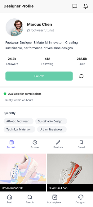
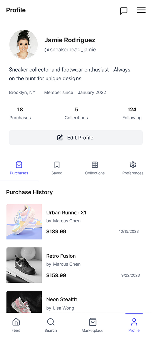
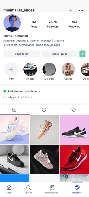
Profiles adapt based on who's looking at them. A public visitor sees a portfolio. A buyer sees purchase history and commission options. A designer gets full control over their presence and analytics. Same person, different views, because the relationship is different.
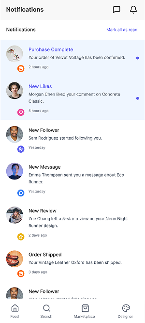
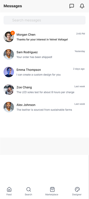
The communication layer, notifications, messages, posting, is kept deliberately fast. Posting shouldn't feel like a production. If sharing work becomes a task, designers stop doing it. The whole thing had to feel light enough that using it regularly isn't an effort.
Button states, transitions, feedback animations, all of it was kept subtle. The goal was for the app to feel responsive and alive without the interactions pulling focus from the content itself.
The moments I focused on most: following a designer, completing a purchase, navigating between sections. Small signals that tell the user the system noticed what they did. That's what makes an app feel considered rather than just functional.
Forge pushed me to think in systems rather than screens. Every individual decision had to connect to a user's motivation somewhere upstream. That's a different kind of design work than making a single screen look good.
I left out payment configurations, deep settings, and system-level screens on purpose. This wasn't about simulating a finished app. It was about proving the structure makes sense and the experience feels right before any of that enters the picture.
What I'd do differently: the commission flow deserves its own distinct experience. It's the most interesting part of the platform, direct designer-to-brand collaboration, and right now it's just a branch off the marketplace. It should be its own thing.
Next Project